

Sky Service app
Sky have a customer base of over 10 million people and need to provide the best service to avoid losing them in a very competitive market. This involves a large volume call centre and a help and support section on the website and Sky Service app.
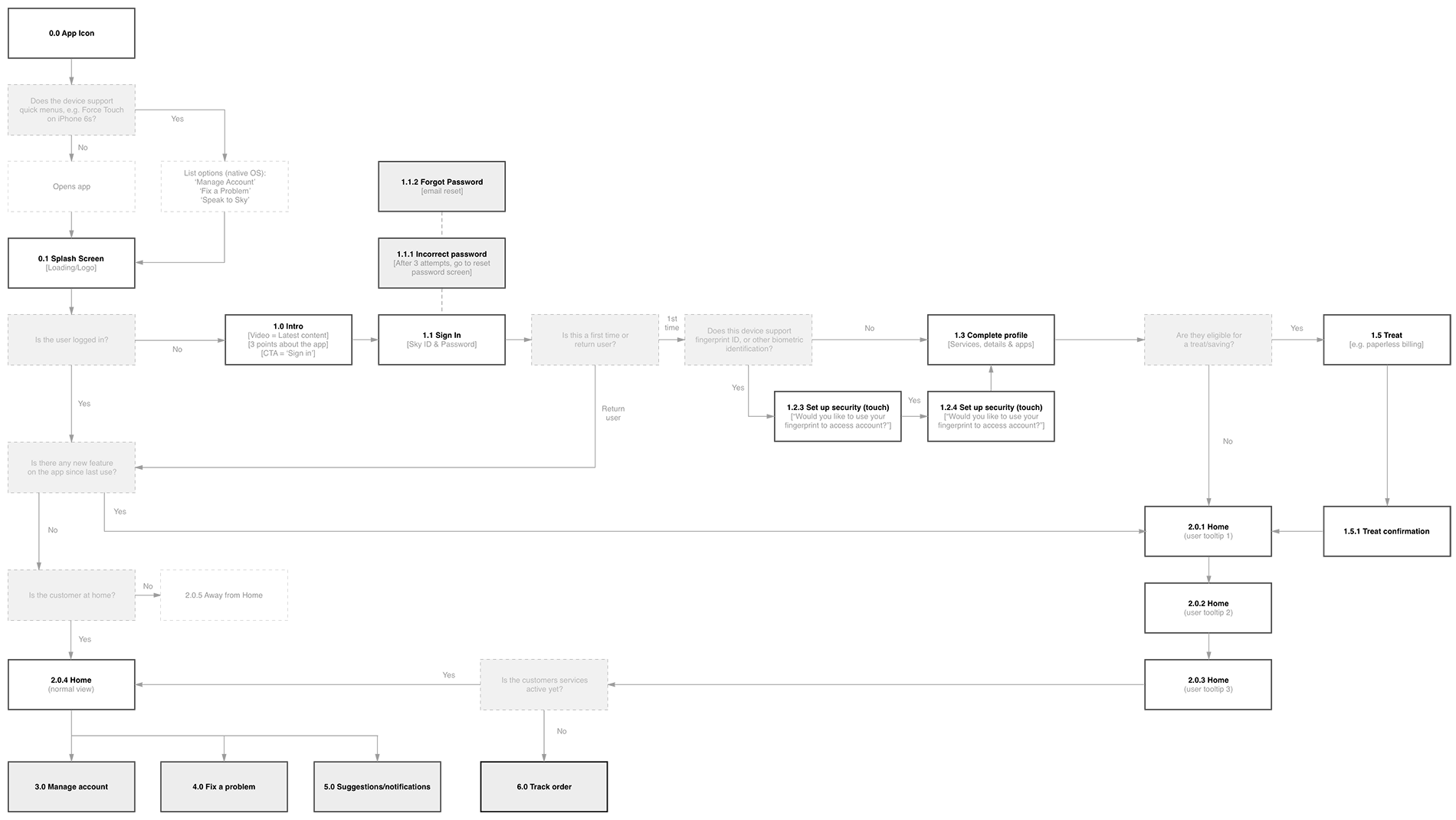
Our task was to re-design the Service app to improve the ability of customers to diagnose problems and find solutions within their experience with Sky. In theory reducing the vast number of calls to the call centres, which would save millions of pounds each year.
Role
Lead UX/UI design
Agency
WCRS
Client
Sky
Date
Feb – July 2016
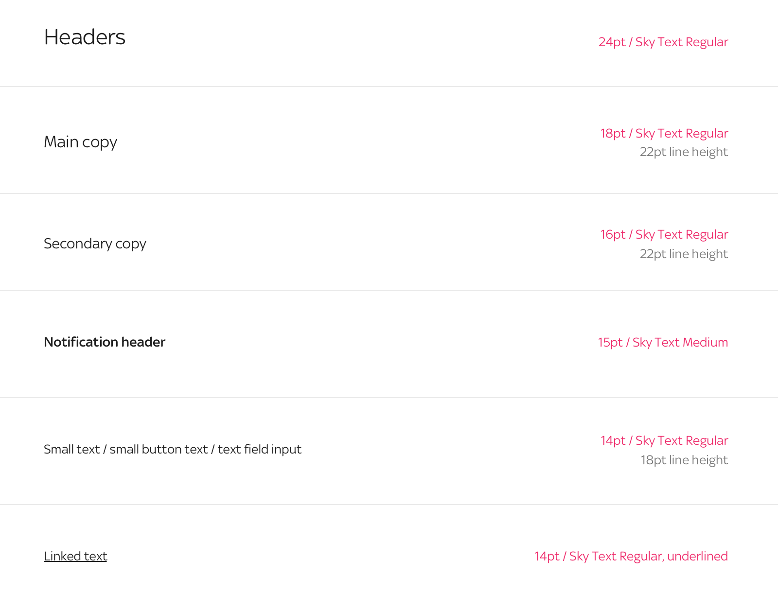
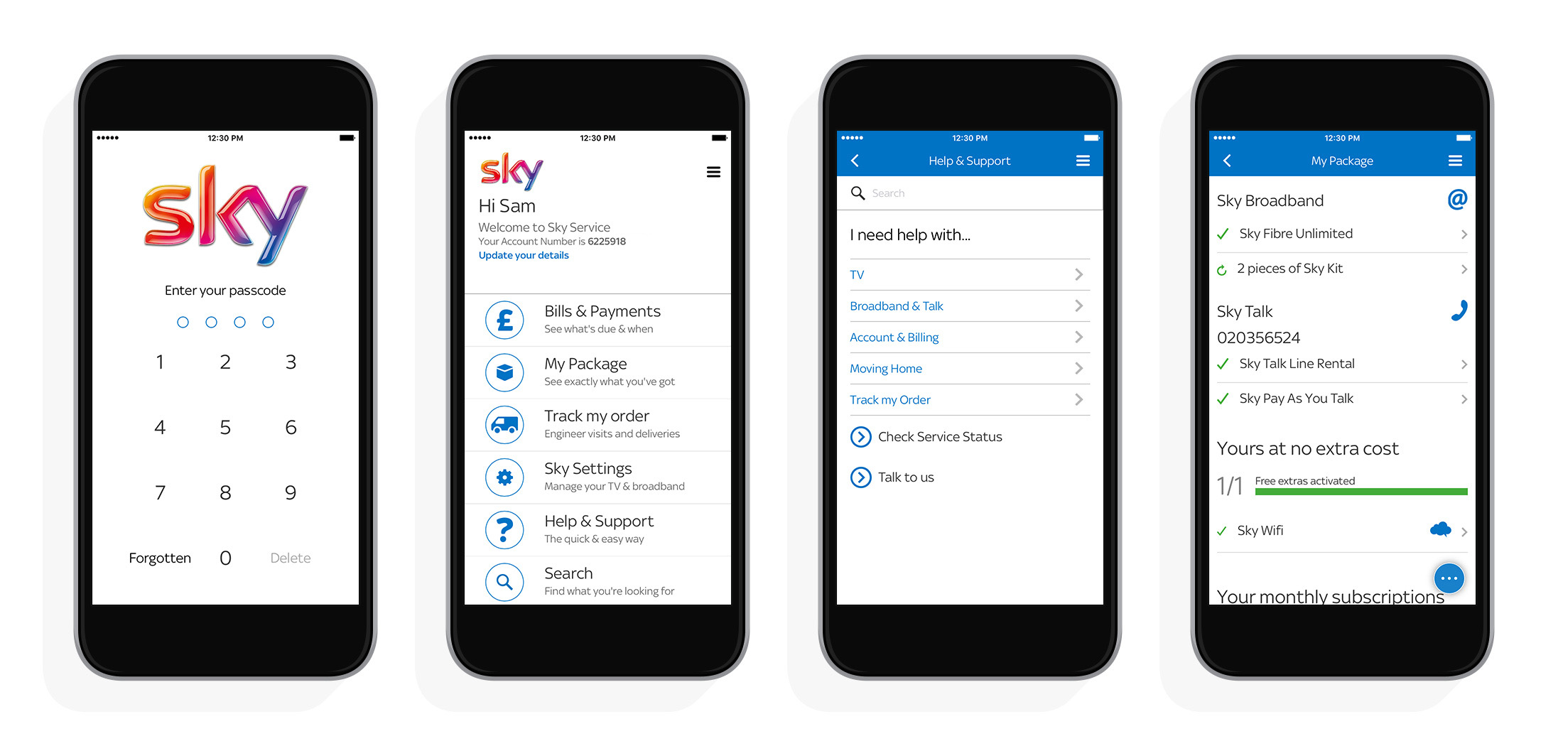
What it looked like before

Simplified experience
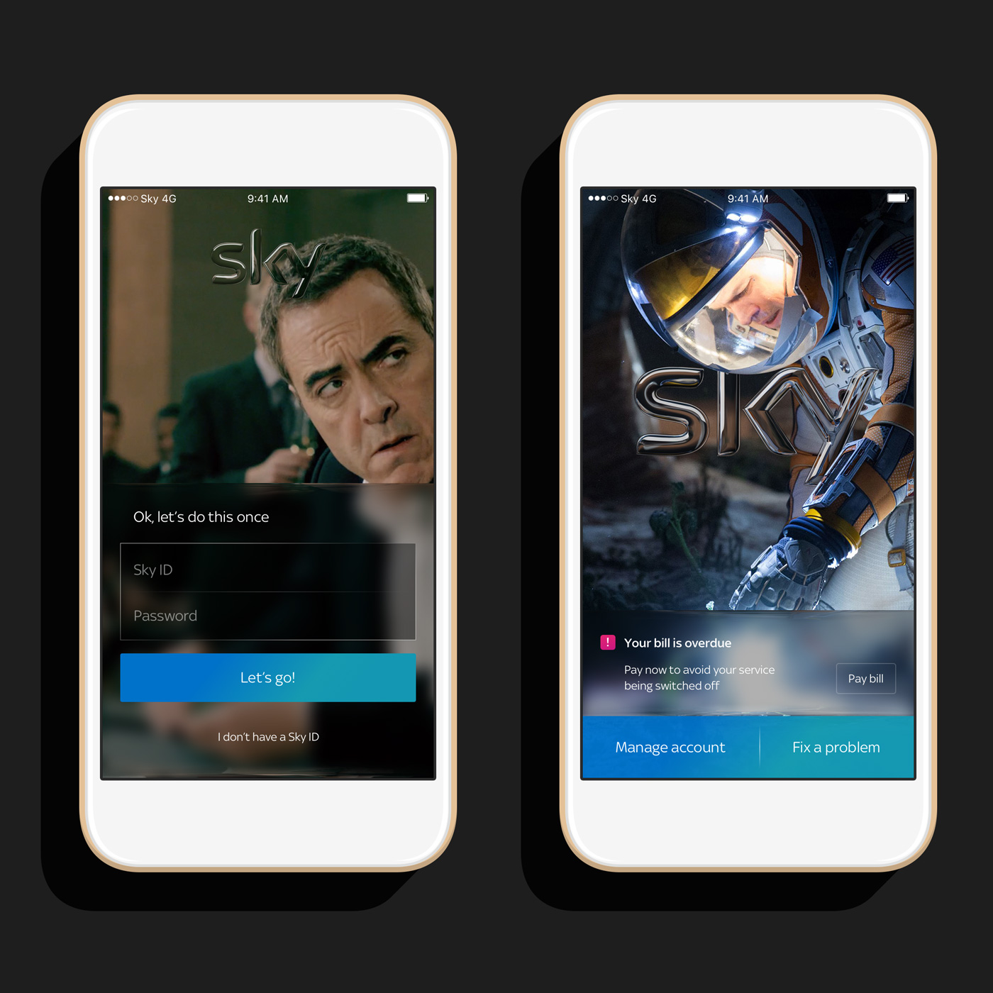
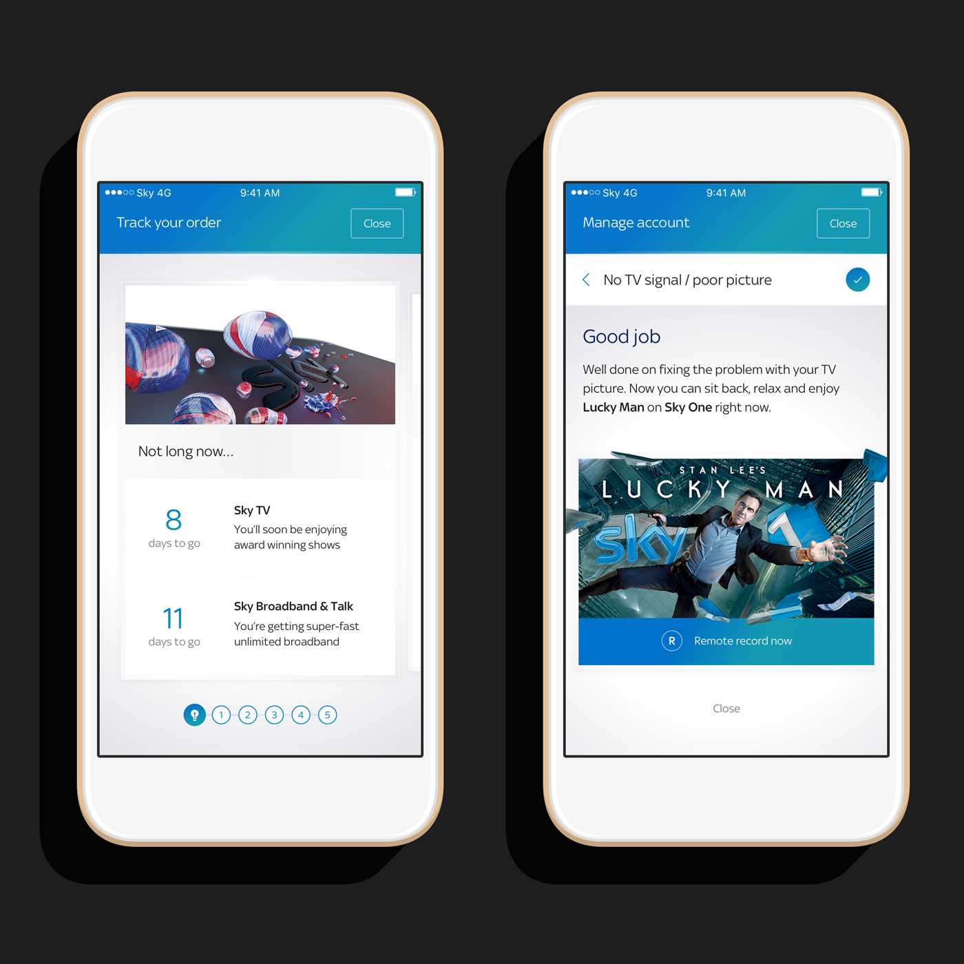
We stripped back to the very basics of what the app needed to achieve and simplified the experience into 2 main areas, managing the user's account and fixing a problem.
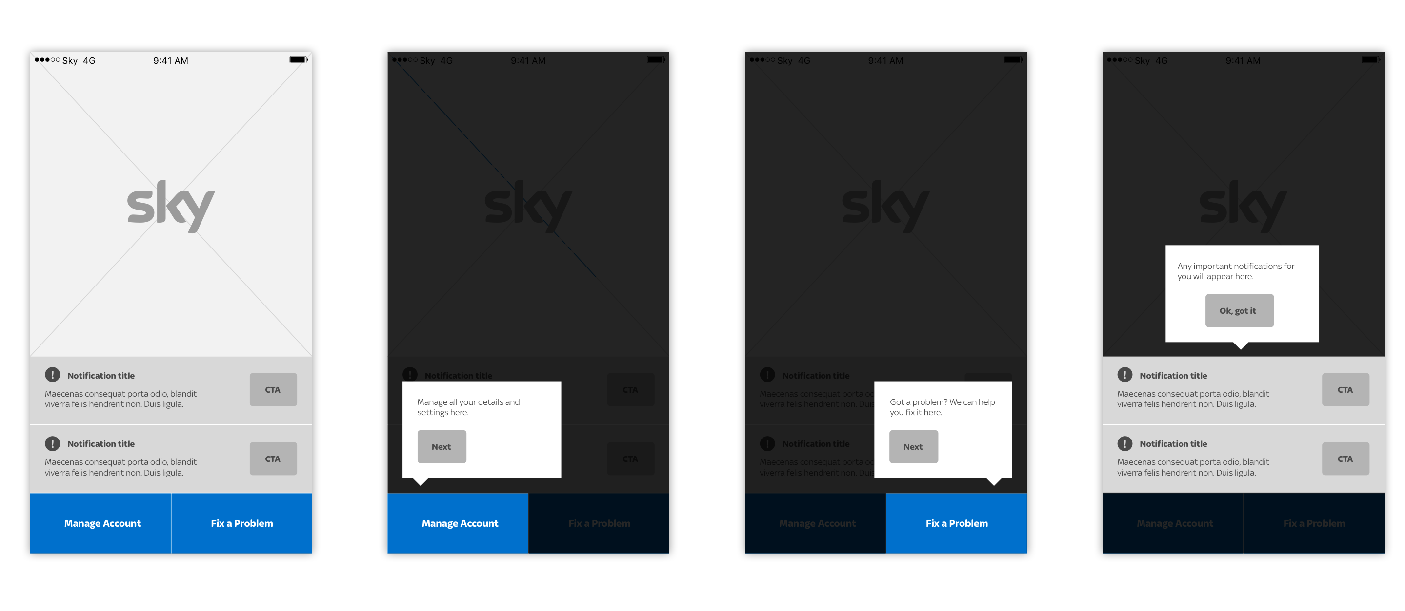
The initial experience of the app has reduced complexity too with a streamlined onboarding and quick set up.


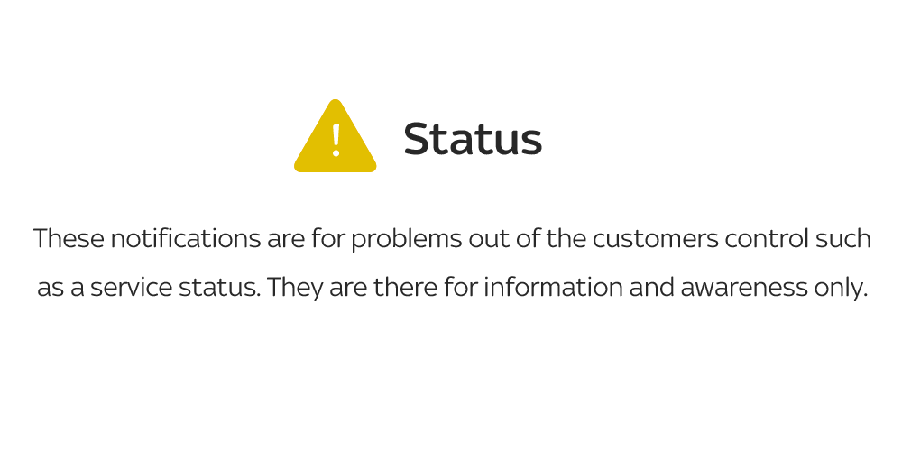
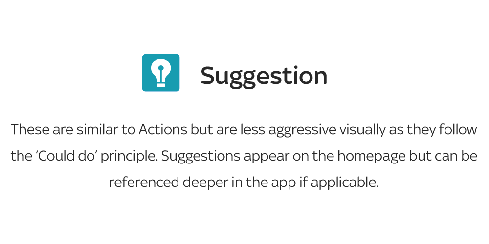
Notifications system
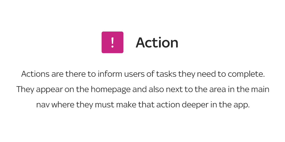
Service apps tend to go overboard with notifications and lack weight in priority. We designed a notifications system that restricts different product-teams of the client from endlessly bombarding the user but allowing emergency notification to take priority.

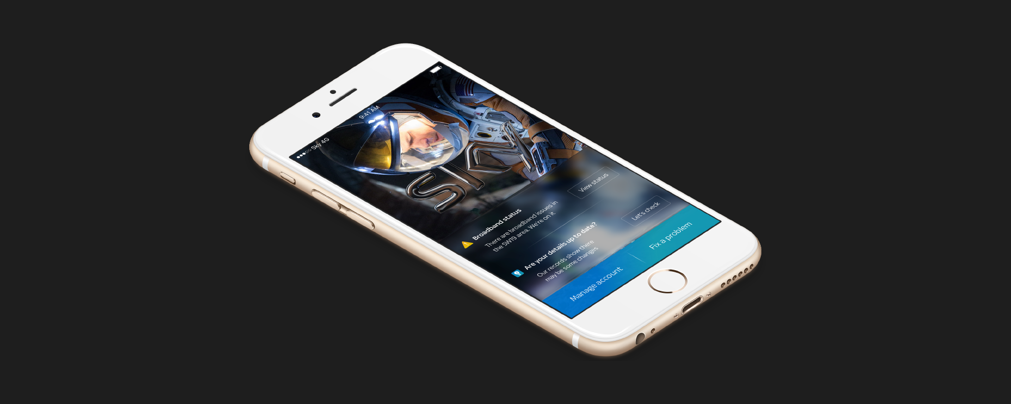


Visual direction
Following on from the sky.com re-design the year before, we carried over principles of simplicity in the design with the on-brand glass effects. Being an entertainment company we wanted to include visual that excite the user about the product whilst still showing the key information in a clear way.


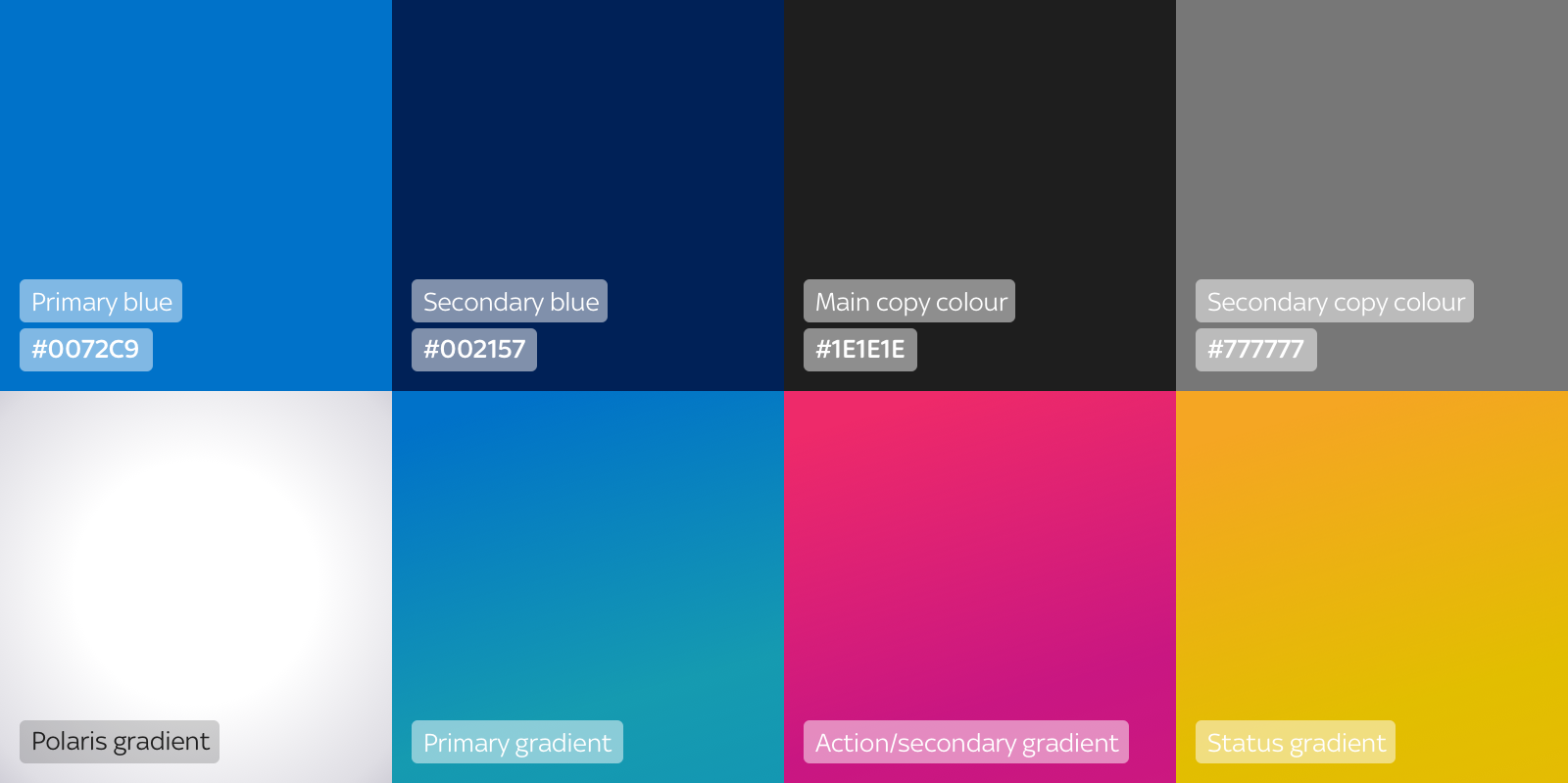
Colours

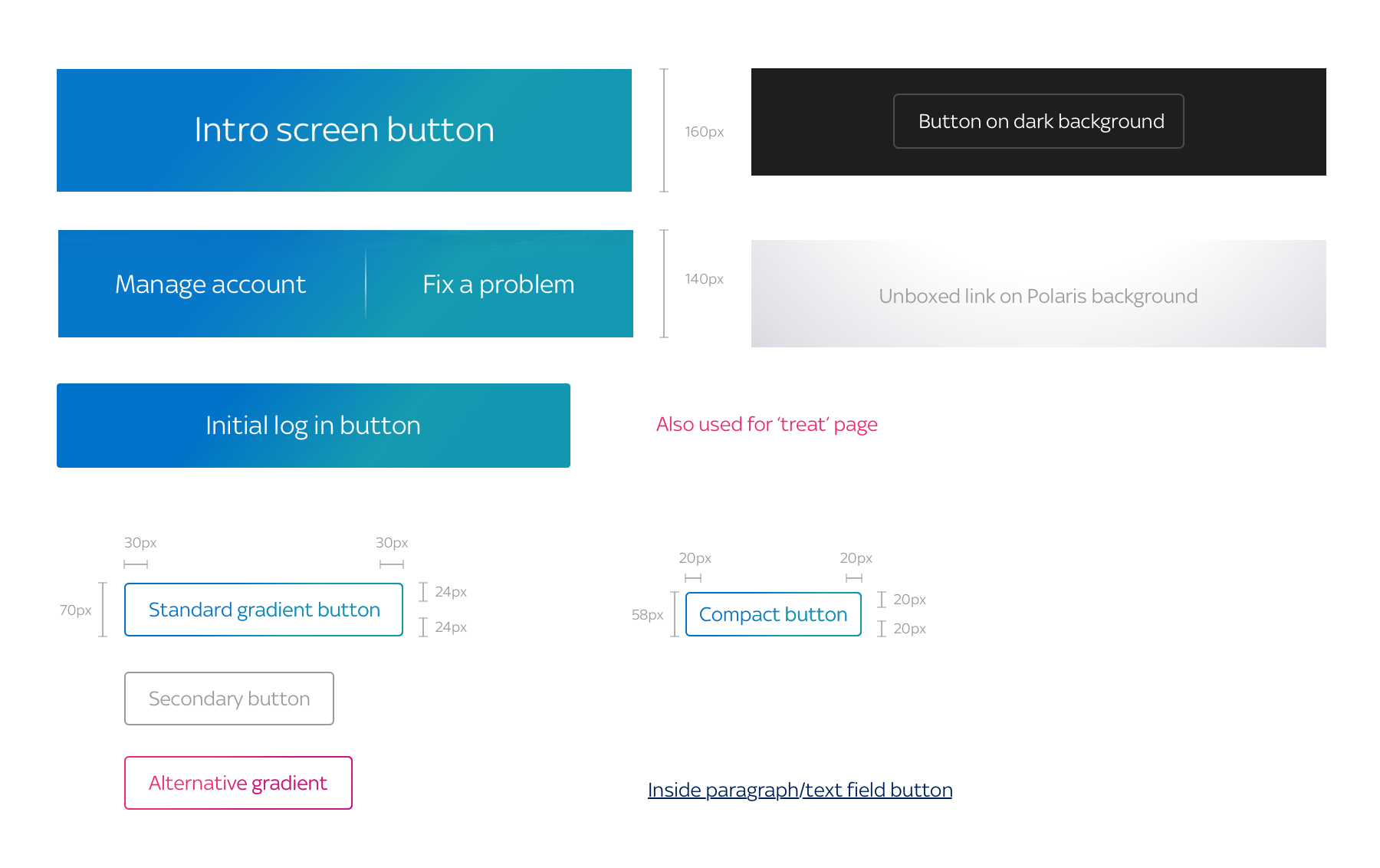
Buttons

Typography