
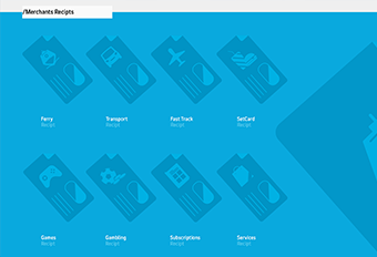


AX
As part of Engine’s new Management Information System to replace FocalPoint, I designed the app interface from a list of requirements to remove the barriers and complexities that users currently experience when submitting their timesheets and expenses.
Role
Lead UX/UI design
Agency
WCRS
Client
Internal project
Date
June – September 2016
Research & ideas
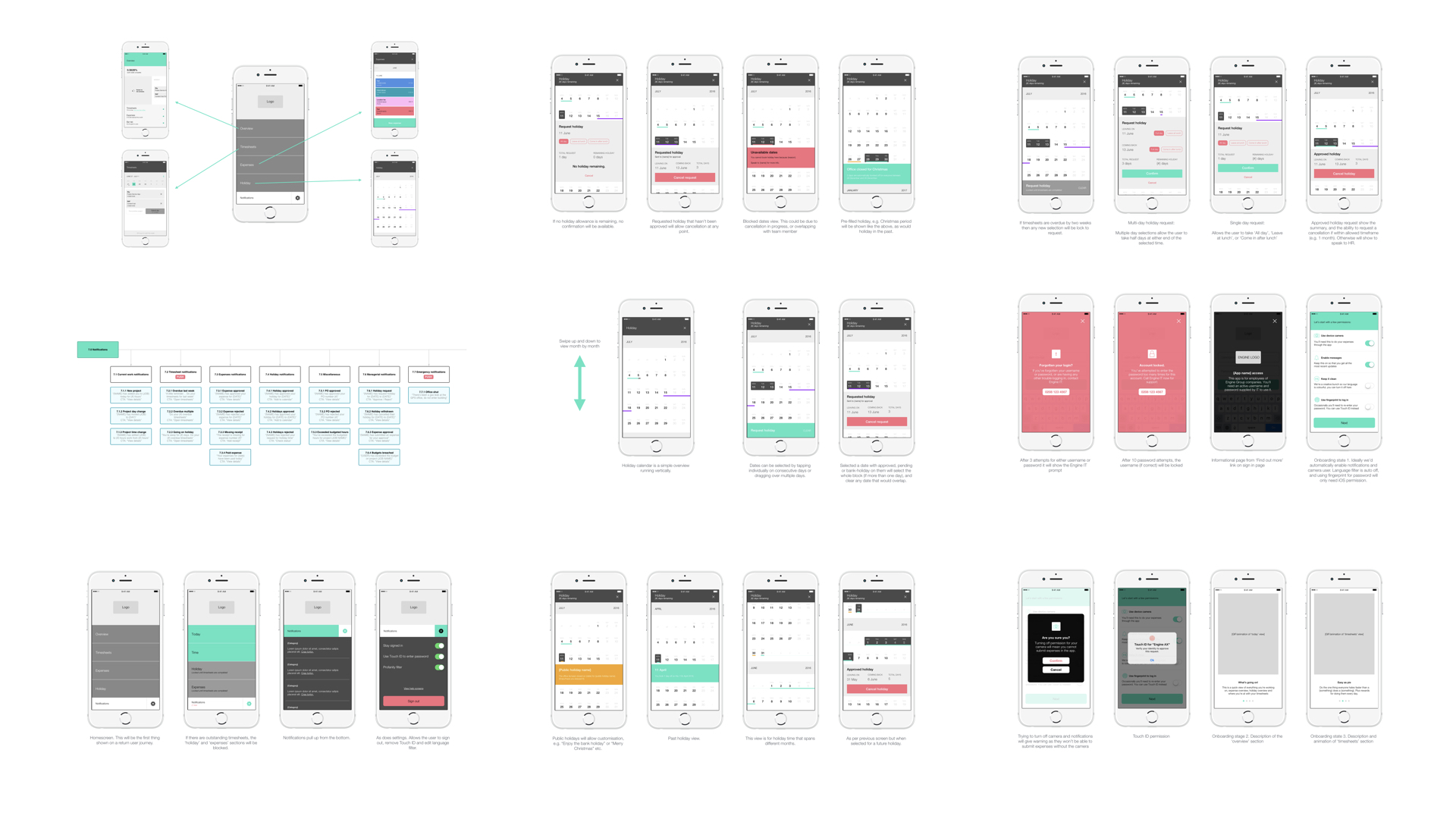
Research was carried out on other similar systems and then proceeded to create user flows, sitemaps and wireframes for an app to help people do timesheets, submit expenses and book holiday in a simple, clear and intelligent way.
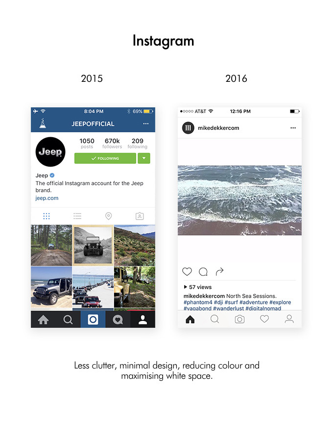
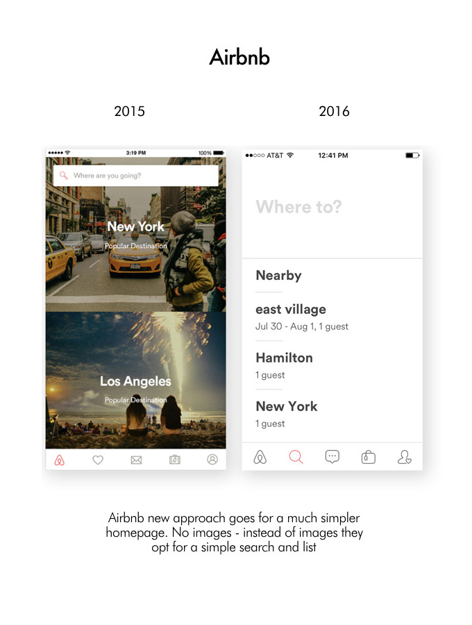
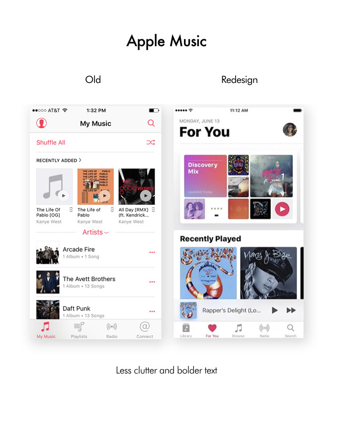
We also looked at UX trends with 3 of the most famous examples around in reduction in complexity.


Wireframe & prototype
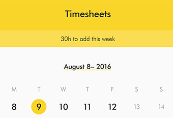
We wanted the app to be as simple and easy to use as possible so that the users could do their timesheets in 30 seconds on the train, or submit an expense receipt after a client dinner. By only have 3 main sections it kept it so simple that there’d be no excuse for not submitting these business necessities.
I created a prototype in wireframe mode to for reference for developers and stakeholders.

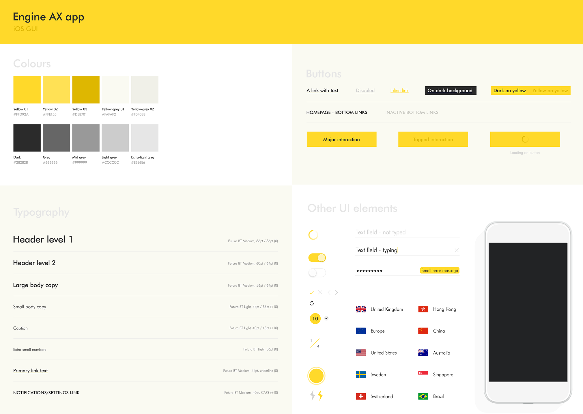
Design principles
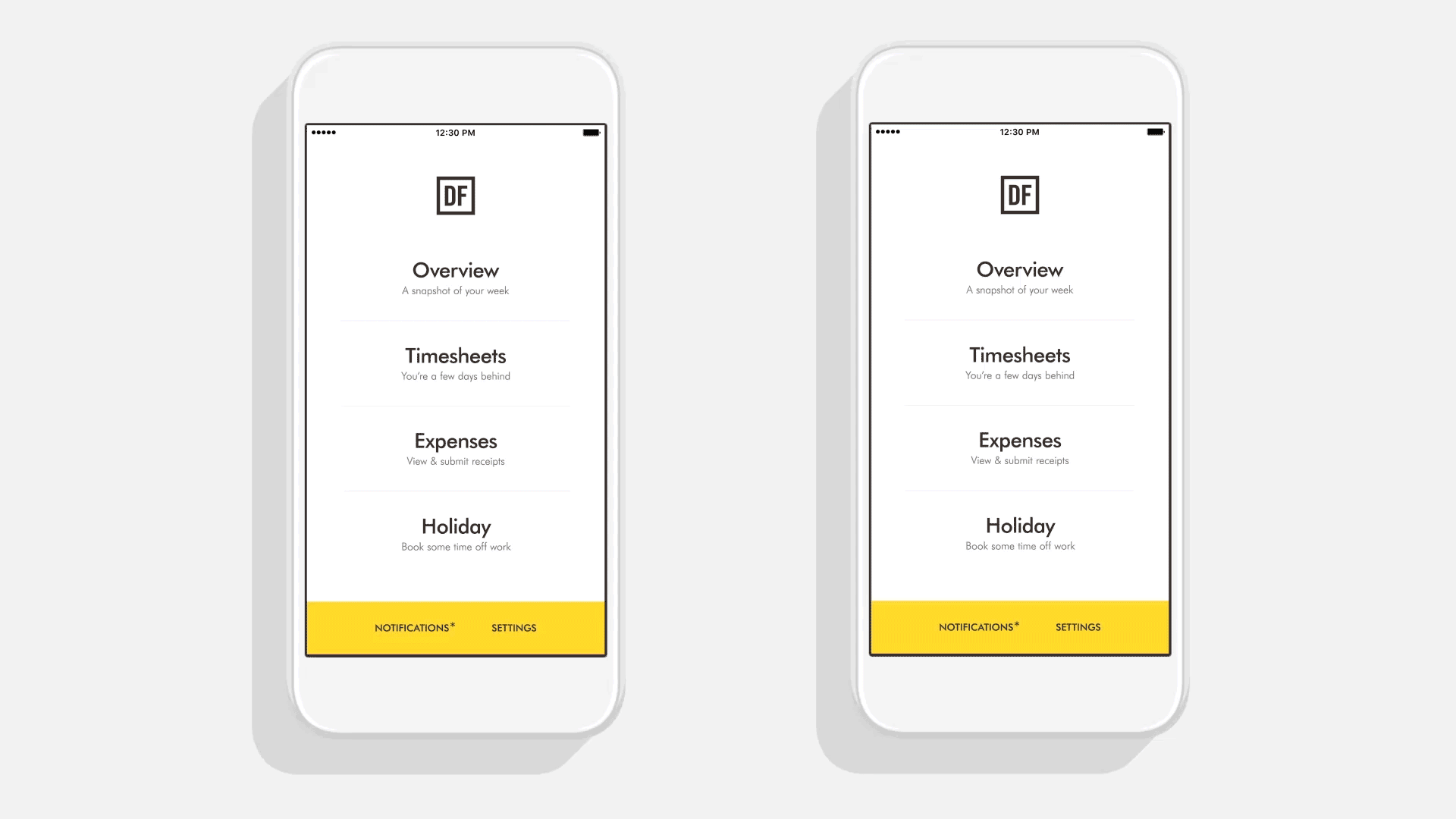
Reduce colour
We decided that one colour, but used it extremely sparingly is best. Everything else better be black and white.
Bigger, bolder headlines
Got a headline? Bump it up about 20 to 30 pixels and make it bold
No pointless icons
The icons better be universal and no colour allowed here either.
Double, NO, triple your white space
Maybe even quadruple it. You really can’t go wrong here.

Guiding developers
To help the developers gain a better understanding of the creative direction I animated the main transitions, sent a fully annotated journey, and included a full GUI.